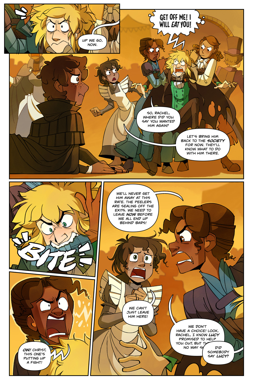


"I will eat you!!" is another oblique BBC Jekyll reference. It's yet another throwaway Hyde line, but it stuck in my head because there's something childish and whimsical about it, like a child pretending to be a shark.
Someone pointed out that Lanyon had a case of babyface on last week's page. That was an accident, but I wanted to briefly point out that my art style has gone through some growing pains this year. I had to do some design work for my job that required me to study other artists' styles, and I realized that I'd been making a pretty glaring and embarrassing mistake while drawing faces for a long time.
You know those face drawing tutorials that draw an egg and then divide it in half vertically to find the proper placement for eyes? That technically always looked weird to me and so I tended to place eyes higher on the face (for adult characters, anyway). But after I did some studies and trace-overs, it suddenly struck me that oh no, those tutorials were right all along. Ever since, a huge amount of my character drawings have looked wrong to me. I've been trying to course-correct and draw faces that feel "right" proportionally, but it's resulted in some growing pains for my drawings, especially for Jekyll and Lanyon. I'm hoping things will even out soon.
Incidentally, I've been going through a similar process with color. A few people have complained that the color work here looks "washed out" when compared to earlier pages. I think this is only true for brightly lit scenes (where the "washed out" look is at least partially on purpose) but I'm experimenting with ways to make day scenes look more vibrant without creating a chaotic mess.


